Chapter 4 Visualization
Researchers want to control the data they generate. Hence visualization of the data is key. Researcher want the overview and they search for known (e.g. effects) or unknown patterns (e.g. biases) in the data. The current classical tools (e.g. GraphPad, excel) are not made to visualize large complex data sets. Tercen cross tab window allows researchers to interact and configure complex views.
Cross-tab window
The cross-tab window is opened by double clicking on a data step in a workflow. The cross-tab window allows the researchers to create any visual by dragging-n-dropping factors to the appropriate section of the cross-tab window.
The cross-tab windows is composed of six sections.
| Section | Location | Description |
|---|---|---|
factor |
top left | shows the available factors |
filter |
top middle | defines the filters for the view in graph section |
layer |
middle middle | defines the layers for the view in graph section |
namespace |
middle middle | defines the filters for the view in graph section |
run |
bottom middle | defines the filters for the view in graph section |
graph |
top right | displays the resulting view |
Researchers create a visual by drag-n-dropping factors from the factor section into one of seven zones : row, column, x-axis, y-axis, color, label, error bar.
| Zone | Section | Description |
|---|---|---|
row |
graph | row dimension of graph |
column |
graph | column dimension of graph |
x-axis |
graph | x-axis dimension of graph |
y-axis |
graph | y-axis dimension of graph |
color |
layer | colored by the selected factor |
label |
layer | labelled by the selected factor |
error bar |
layer | an error bar using the selected factor |
The factors are both the variables and annotations of your data (e.g. column headers in your uploaded data). The factors are dragged over to the zones in order to create the visualization or desired projection. Researchers may either create their own view or use an app pre-configured views.
The cross-tab window also allows the concept of layers. A layer allows the researcher to superimpose different views and build up sophisticated graphics.
Layers
Layers are created in the cross-tab window. Each created layer has the same row, column, x-axis definition but allows the researcher to configure a different y-axis, filter, color, label and error bar which are all found in the layer section.
Filters
Filters are found in the filter zone of the cross-tab window. The filter allows the researcher to remove data from the view. A filter is created, modified or deleted.
To create a filter you require to drag over a factor from the factor section to the filter section. The filter is configurable by double clicking on the filter itself. A previously defined filter may also be added by click on the + button. A list of previously defined filters appear and can be selected.
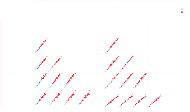
Multi-pairwise
Researchers typically compare conditions using a scatter plots. These plot are often repeated over and over again, imagine if researcher could generate many scatter plots, for all the conditions, in one go. This is possible with the multi-pairwise view.
Multi-pairwise is configured in the cross-tab window. It is created by dragging-n-dropping the same factor in the row zone and in the column zone. Note, a factor requires to be defined in the label zone. This allows the projection to know what factor separates data points in the pairwise plot.
A typically configuration example is when researchers are comparing different gene measurements in different samples and wish to have a sample to sample pairwise plot. The factor (say sample_id), representing the sample, is placed in the row and column zone. The factor (say measurement) representing the values is placed in the y-axis zone. The factor (say gene_id), representing the different genes which were measured, is placed in the label zone.
Examples
Here are a few examples of the configuration flexibility of the views.
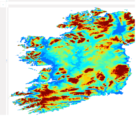
Heatmap View configuration: column, row, color, heatmap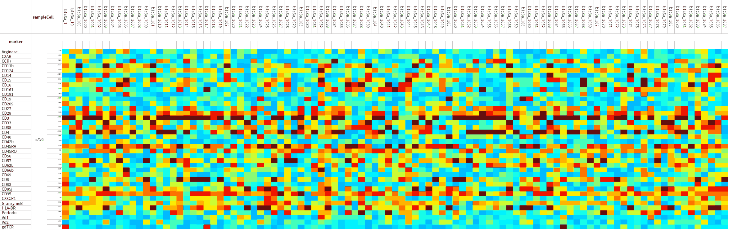
For more examples of visuals please look at the public Tercen projects called “Data visualization gallery”, or click this link
Data Navigation
Here are two main navigation modes to move around in the data in the cross-tab view:
- squashing the cross-tab view in and out
- scrolling the cross-tab view vertically and horizontally
To perform squashing on the columns:
- position the mouse cursor on the columns
- press the Ctrl key and roll the mouse upward and downwards
- the view changes by squashing in the horizontal direction
To perform squashing on the rows:
- position the mouse cursor on the rows
- press the Ctrl key and roll the mouse upward and downwards
- the view changes by squashing in the vertical direction
The perform scrolling, there is a vertical and horizontal scroll bar.
