Chapter 7 Data projection and visualisation.
In this section we will…
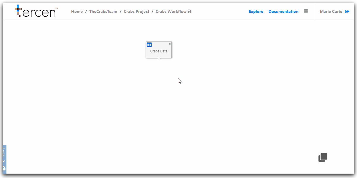
Add a data analysis step to our workflow.
Review the projection screen.
Assign factors to make a projection of the data.
Visualize our projection as a Heatmap.
Add an analysis Data Step
Right click on the Data Table step to bring up the long menu.
Click Add
Select Data Step
Click Ok
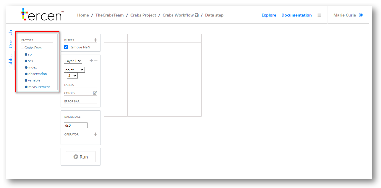
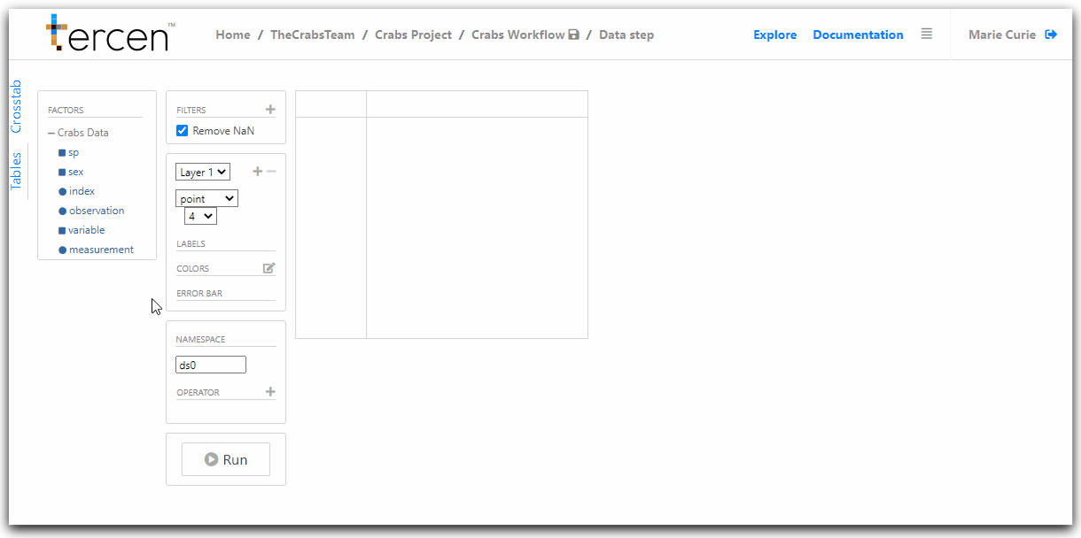
You will be taken to the Cross-tab Projection Screen
Understanding the Cross-tab Projection Screen
The projection screen is made up of zones which display data or allow it to be manipulated.
The first two to understand are the factors list and the projection grid.
Factors are the individual categories of your data which can be manipulated into a visualization.
A Factor can be a variable in the data you uploaded or the results of a computation performed on it.
Click on the + icon beside Crabs Data
You will see the factors listed are the headers of the sample data file we uploaded.
The Projection Grid
The projection grid is where visualisations are created and displayed.
There are four divisions to the projection grid.
X-Axis
Y-Axis
Column
Row
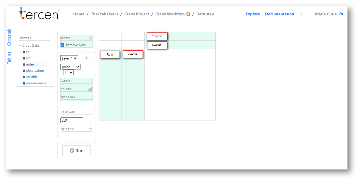
By adding factors to these zones a projection is created and visualisations are made from it.
Factors are added by drag-and-drop from the list.
Definition Controls
In the central tab of the projection screen is the configuration panel.
Drag and Drop factors to the tab name to configure how data is represented on the visualization.
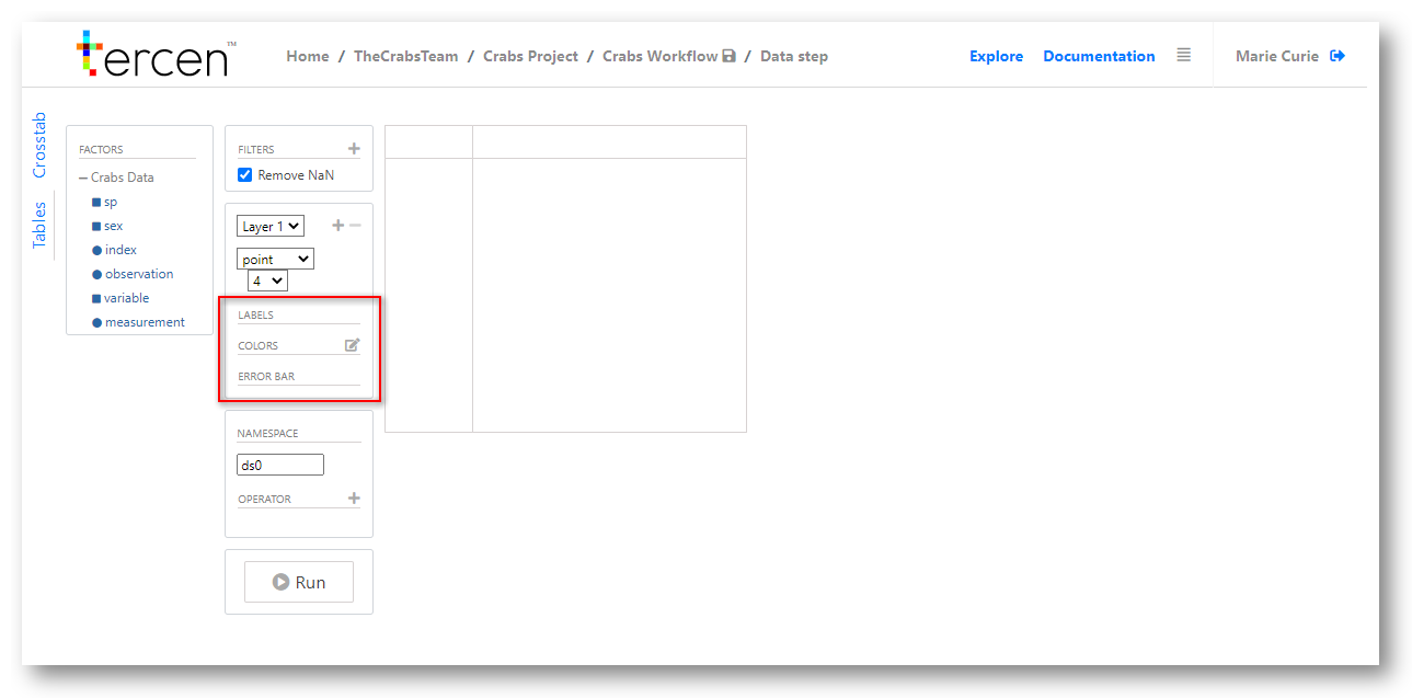
| Zone | Description |
|---|---|
| Label | Additional description or separation applied to a factor. |
| Colours | Control visualisations by assigning colors to values |
| Error Bar | Shows margin of error on calculations (e.g Standard Deviation) |
Make a projection of the Crabs Data
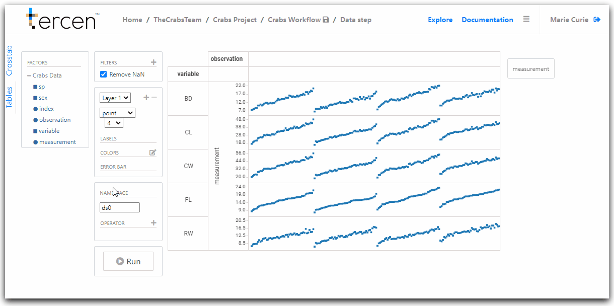
Drag and drop factors to zones on the projection grid as follows.
observation to column
measurement to y-axis
variable to row
Re-size your visualization by grabbing the grid lines and dragging them closer together.
Notice, the variable factor is the row and the observations are the columns.
By default Tercen will sort data from low to high values.
We have visualised the 5 measurements (rows) against the 200 crab specimens columns.
Configure the data visualisation as a Heatmap
By changing control settings the data projection can be visualised on different ways.
Drag and drop the Measurement factor to the Colors zone.
A gradient is formed based on the values in the data
The higher values are assigned the “hot” colors and the lower ones “cold” colors.
Change the visualisation setting from point to heatmap.
Congratulations, you have created a Heatmap visual.
Next… analyze the data by performing a multi-pairwaise comparison