Chapter 8 Multi-group pairwise visualisation
In this section you create a multi-group pairwise visual of the raw data.
This technique puts the same factor (variable) on the row and column zone.
The resulting view is a powerful tool for data visualization.
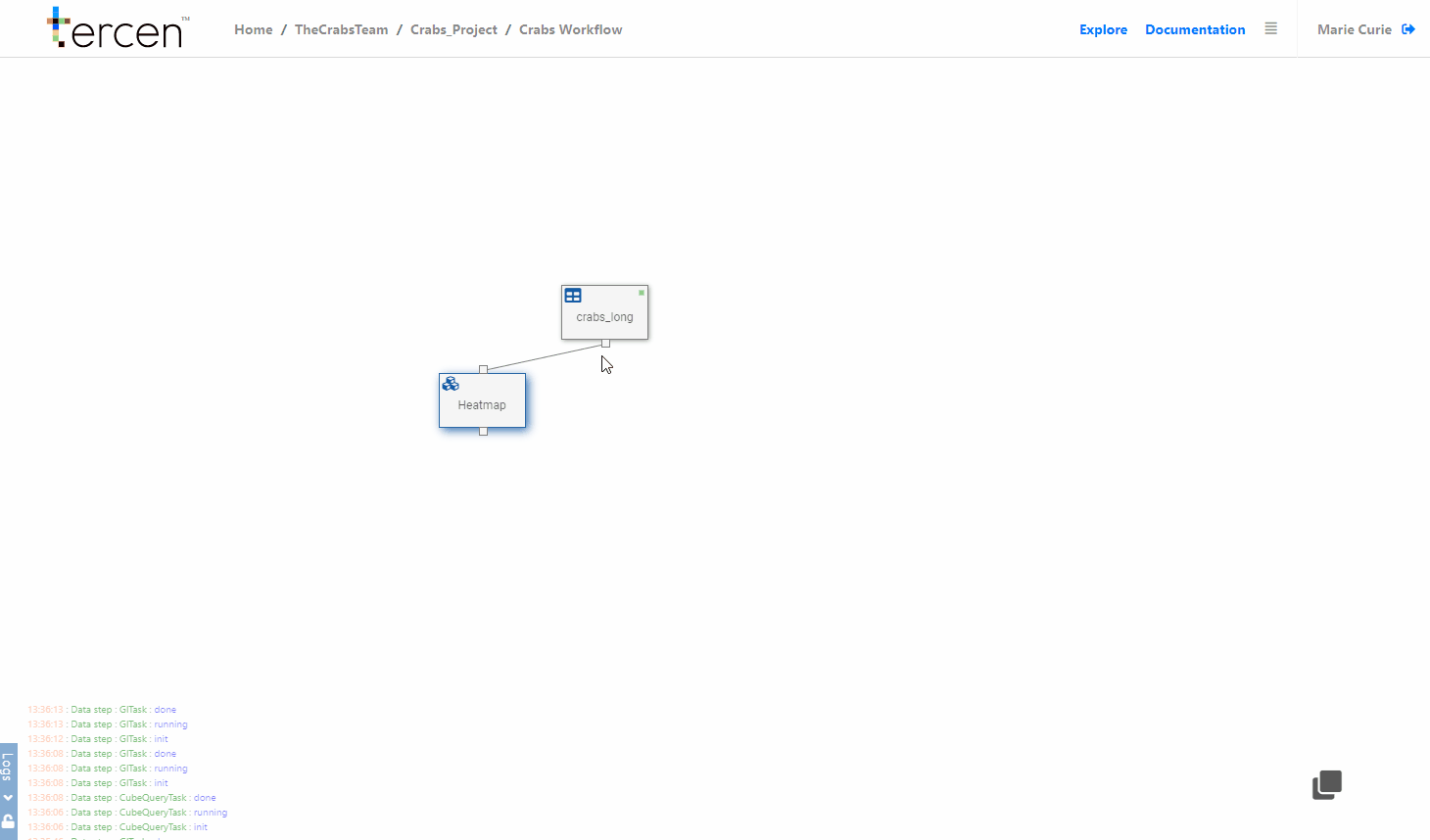
Add a data step
From the workflow builder screen.
Click on the Table data step
Select Add
Choose Data step
The projection screen will open.
Drag and drop the following factors into the grid…
measurement to Y-Axis
variable to column
variable to row
observation to labels
Color to colors
Re-size the projection by dragging the grid lines tighter.
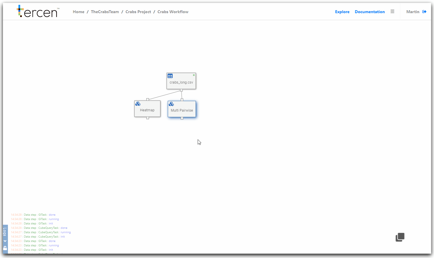
You have now visualized a multi-group pairwise projection.
The crab characteristics are compared to each other and the suspected species (color) are split in the cells for comparison.
Remember to return to the Workflow Builder and rename the step to “Multi Pairwise”
You can drag it into position to make it more view-able.
Further split the Groups
Drag and drop these factors.
sex to column
You have now sub-divided your multi-group comparison by sex.
Next… make a PCA calculation of the data.